
Crafting a seamless patient portal telemedicine experience
Telemedicine makes it possible to get quality care without leaving your home. I designed a telemedicine experience that helps patients and physicians work together to address health problems and improve treatment outcomes using digital tools.
My Role
I conducted all stages of the design process, from research to ideation to execution.
Type
Passion project
Timeline
7 days
Tools
Figma
Zoom (usability testing)
Solution Preview
Streamlined appointments page
Easily manage all appointments while having quick access to your care team.
The appointments page allows patients to schedule new appointments, keep track of past and upcoming sessions, and message their doctors.
In-call features
Take notes during sessions and view files shared by your clinician.
Navigate between different in-call features while maintaining face-to-face contact with your doctor at all times.
Manage medications
Set medication reminders and receive medication updates in real-time.
Patients can stay on top of their medications by being notified of updated medications and setting customizable alerts.
The Challenge
Forming a connection in a virtual setting can be difficult.
As the world turned towards telemedicine during the COVID-19 pandemic, patients and doctors reported a common challenge: feeling disconnected during virtual appointments.
In order to preserve the human touch in virtual settings, we must craft tools that recognize the humanity behind every screen—a person seeking care and a doctor striving to provide it.
💡 How might we create virtual patient care tools that feel personal and connected?
Constraints
One-woman team: since this is a solo passion project, I lacked engineering resources and teammates to collaborate with. Thus, I got a lot of second opinions during the project to broaden my perspective and account for considerations I may have missed.
Limited access to target audience: while everyone is a patient, I wasn’t able to directly interview doctors during my project. However, I utilized physician forums and research articles to source insights.
The Process
Over the course of one week, I conducted a design sprint to complete this project:

🔬 Research
Putting myself into the shoes of patients and doctors
What is the current telemedicine experience like?
In order to understand goals, needs, and frustrations for patients and doctors, I chose the following research methods:
Patient interviews: I consulted peers who have attended telemedicine appointments and asked open-ended questions regarding their thoughts and experiences.
Physician forums: While I wasn’t able to directly interview physicians, I found a wealth of information and firsthand experiences through online physician communities.
Existing research: A large body of research exists regarding telemedicine and the patient doctor relationship. I examined published papers and data reports to distill key trends and insights.
I categorized my findings into goals, frustrations, and needs.
Organizing my research allowed me to see overarching trends and patterns, as well as proactively consider potential features and considerations for the product.
Affinity Diagram

The current telemedicine experience works, but it could be better.
I distilled my findings into the following key insights:
Pain Points
01
Both patients and doctors find it harder to establish rapport over a virtual setting.
02
Patients often have trouble adhering to treatment plans.
03
Elderly and underserved populations are more likely to use telemedicine (Hung et. al., 2023).
Competitive Analysis
What are current products doing well, and what can be improved?
I examined several key competitors, both in the patient portal and video call space to understand what features and functionalities currently exist in the space.

🪄 Ideation
I established personas of an example patient and physician based on my findings.
To represent target users and create a north star to guide my designs, I created personas around a potential scenario. These personas informed my subsequent work by ensuring that the product is accessible for elderly patients, compatible with existing frameworks, and receptive of emotions that both patients and doctors may be experiencing during the patient care process.
Painting a Picture of Our Users

What actions are vital to the telemedicine process?
To understand how patients may use the patient portal app, I mapped out tasks that users might take throughout the telemedicine experience.
User Flow

Visualizing the patient journey
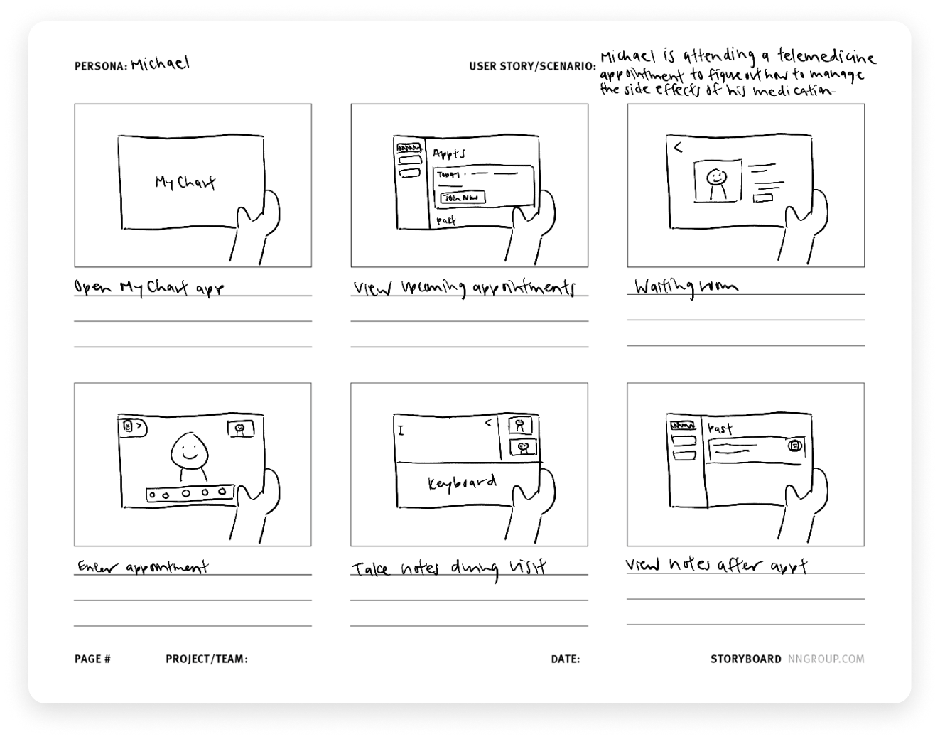
I translated situations from the user flow into sketches to further visualize a patient’s experience with the product. I decided to move forward with a tablet-centered design to accommodate for common telemedicine use cases—as elderly patients often struggle with using keyboards, tablets are often more approachable.
Storyboarding Ideas

🌈 Design
What is the most intuitive way to organize and display features?
I sketched out initial layout ideas, keeping in mind tablet design best practices and how to best utilize the screen space.
Initial Sketches


Paving the way to designing things right
I translated sketches into initial wireframes and mocked up different options to display features. For the note-taking feature, I considered whether a sidebar or center popup design made the most sense:
Translating to Wireframes


I also established potential page layouts and features that should be available in each view:


I ended up moving forward with the latter option to accommodate for typing on a tablet and provide plenty of space for text while maintaining face-to-face view.
I evaluated whether participants could successfully accomplish tasks using the product.
To validate assumptions, I asked participants to complete a set of tasks and observed how they interacted with the product. Participants also provided qualitative feedback that helped broaden my perspective and accommodate for situations that I had not considered before.
Usability Testing
Study Type
4 1:1 moderated sessions
General population ages 25-75
Participants
Through these sessions, I found the following three key insights that informed my design revisions:
01
If patients take an action within the app, the results should be clearly indicated.
02
Visual cues can be better utilized to communicate importance.
03
Too many options can be overwhelming.
Better utilizing tablet screen space through popover modals
Rather than having a full screen takeover, I opted to use a popover to keep the context and allow the rest of the information on the screen to stay useful.
Improvements

Reducing competing information
Instead of having multiple primary CTA buttons, I prioritized main actions that patients would take on the screen to reduce visual load.

The Results
Through testing and validation, I arrived at my final design solution. I presented my designs to industry experts and senior product designers and received overwhelmingly positive feedback! Here are some of the key features of the product:
Final Solution
Easily join video appointments and get the care you need.


Access in-call features to fully utilize your appointment.


Set custom reminders to stay proactive on your healthcare journey.


If I Had More Time
If I had the chance to ship this product in a real world setting, I would:
Consider potential problems that could occur during the patient experience:
Adding “Switch to phone call” option to accommodate for poor connection
Add option to request specialist to help set up first telemedicine call to help elderly patients familiarize with technology
Involve developers early on to understand scope and constraints and make implementation easy.
Introduce an AI summary feature to automatically generate notes from telemedicine call transcription while maintaining HIPAA-compliance and protecting PHI.
Designing for healthcare requires making unique considerations for the diverse needs of patients and healthcare professionals while accounting for the sensitive nature of the field.
There is a reason why healthcare innovation is slow—each change could deeply affect patient lives. Thus, designing for healthcare requires deep understanding and sensitivity for a wide range of use cases.
Throughout this project, I found myself experiencing knowledge gaps, such as what specific functionalities patients with different conditions may need and how to accommodate for all potential needs. Through background research and speaking with potential users, I was able to inform decisions and chart a path forward.
During my final presentation, I received positive feedback on my designs and the way that I put accessibility at the center. In the future, I look forward to digging deeper into the challenges that come with tackling high stakes industries and systems in dire need of an update.