
Meadowlark Dairy
A mobile web app that helps an ice cream shop streamline its customer experience.
ROLE
Product Designer
TIMELINE
Fall 2022 (8 weeks)
User research
Interaction design
Visual design
TOOLS
Figma
SKILLS
Meadowlark Dairy is a local ice cream shop in Pleasanton, California with over 100 years of history. However, the store lacks a cohesive and updated website to provide information and offer services to customers. Thus, I designed a mobile web app in order to better service customers, increase Meadowlark’s online presence, and easily allow usage across device types.
Background

Design Process
The Challenge
Creating a one-stop resource where Meadowlark customers can easily access useful information and make purchases.
User Research
To understand how my target audience interacts with ice cream shops, I conducted a 5-question interview on 4 participants. The interview questions were designed based on the following:
Initial interviews
GOAL
To understand consumer behaviors and frustrations when visiting an ice cream shop.
HYPOTHESIS
Consumers tend to visit ice cream shops as a social activity. They prefer shops that have a good reputation and updated online information.
I compiled findings from the interviews to understand the user’s feelings, beliefs and needs.
Highlights:
Empathy map
“I feel satisfied when all information is in the same place.”
“I feel more confident ordering from an English menu when there are pictures that depict each item.”
“I am confused when it’s hard to tell where to click on a website.”
“I associate a business’s website with how established and professional it is.”

Key Findings
Many businesses have inaccurate information online.
FINDING #1
Consumers are frustrated when a business’s website says that it is open, but they find out upon arrival that it’s actually closed.
Businesses with functional websites are more trustworthy.
FINDING #2
Oftentimes, a website is a consumer’s first impression of the business.
FINDING #3
Customers expect to find info through a business’s website.
Consumers decide where to go based on photos, hours, menu items, and other information that can be presented through a website.
My findings helped me narrow down target value propositions to be personable, accessible, and useful.
Value propositions

Ideation
I planned out each screen and interaction that will be included to ensure that each feature has a definitive purpose. Then, I sketched out potential layouts for each key screen and determined which options were optimal based on information hierarchy, screen space utilization, and visual design principles.
Design Explorations

User journey map.
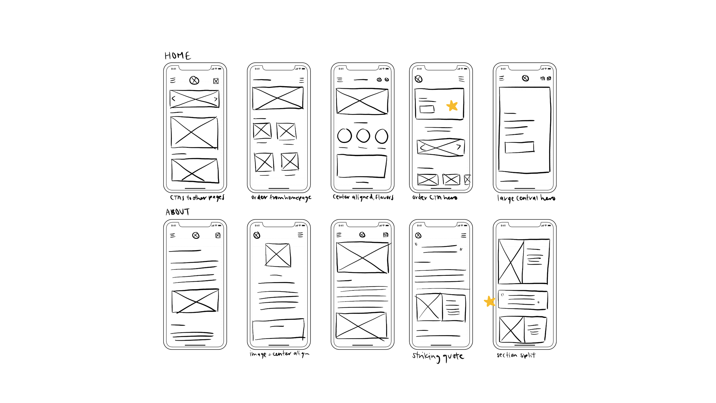
Explorations of home screen and about page designs.

Explorations of menu, hours and location, and online ordering page designs.
Moving into digital wireframes, I aimed to make each flow straightforward and in-line with familiar navigation patterns so that users would immediately be able to find what they need.
Low-Fidelity
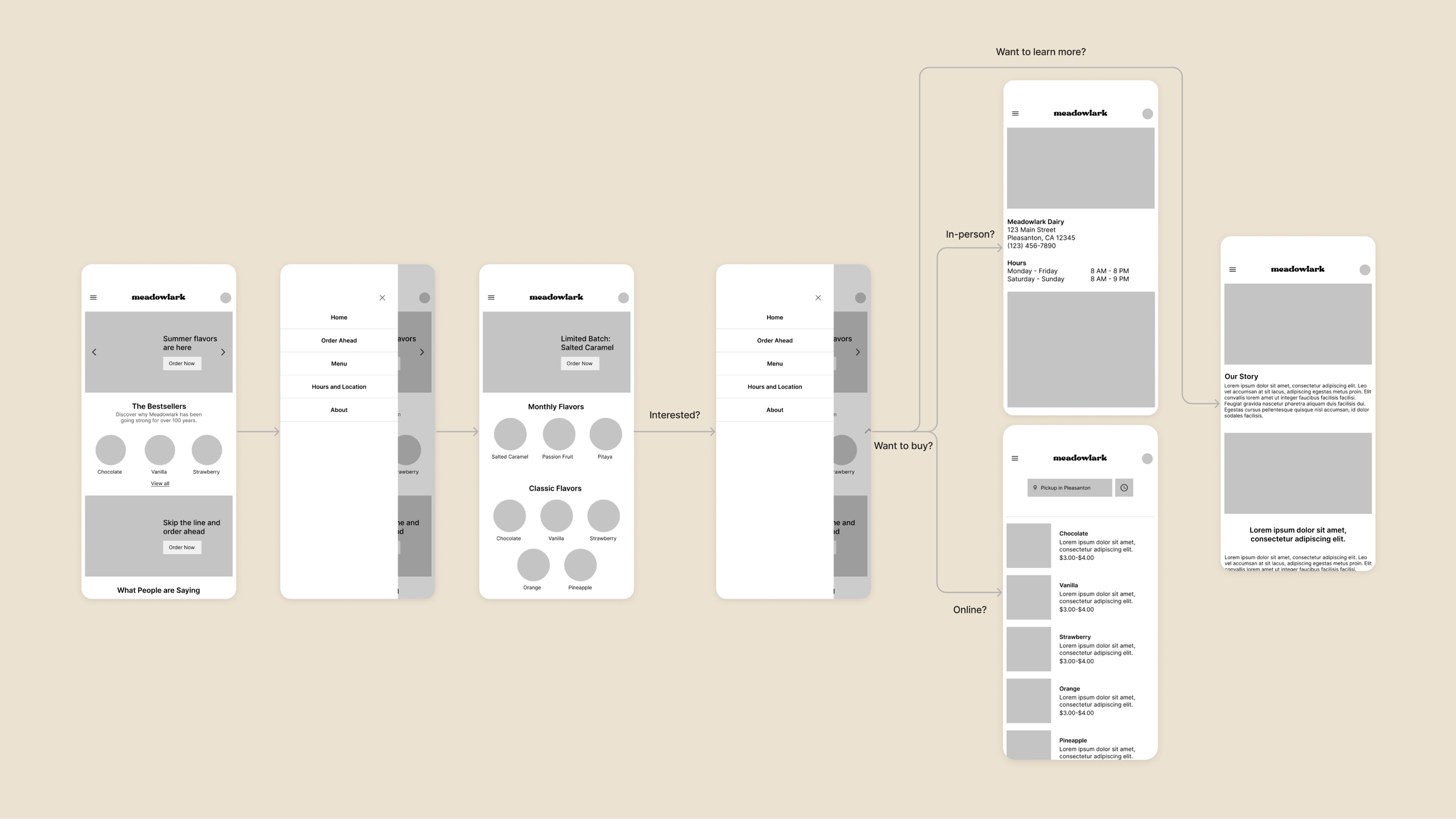
User flow from checking flavors to making a purchase.
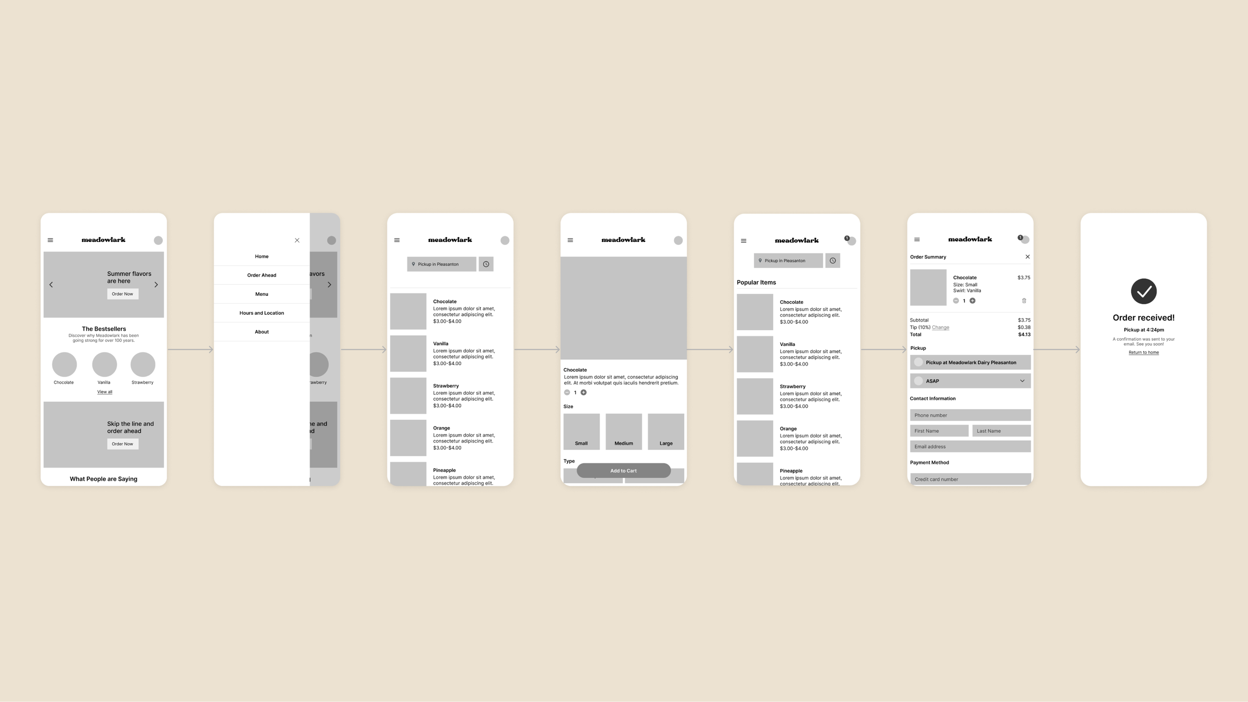
User flow for online ordering.
I conducted a moderated usability study on 5 participants, who were asked to complete 3 actions and provide their overall impression of the app. Their feedback revealed that while the app was generally easy to use and has all the information needed, certain design and copy choices were confusing.
User Testing
I organized my findings to compile key attitudes and areas of improvement in my initial design.
I compiled the highlights below:
Empathy map
Instinctively clicked first CTA button before opening navigation menu to find information
Skeptical about ordering ice cream for pickup
Overwhelmed by the number of “Order Now” buttons worded in multiple different ways
The navigation is simple and straight-forward

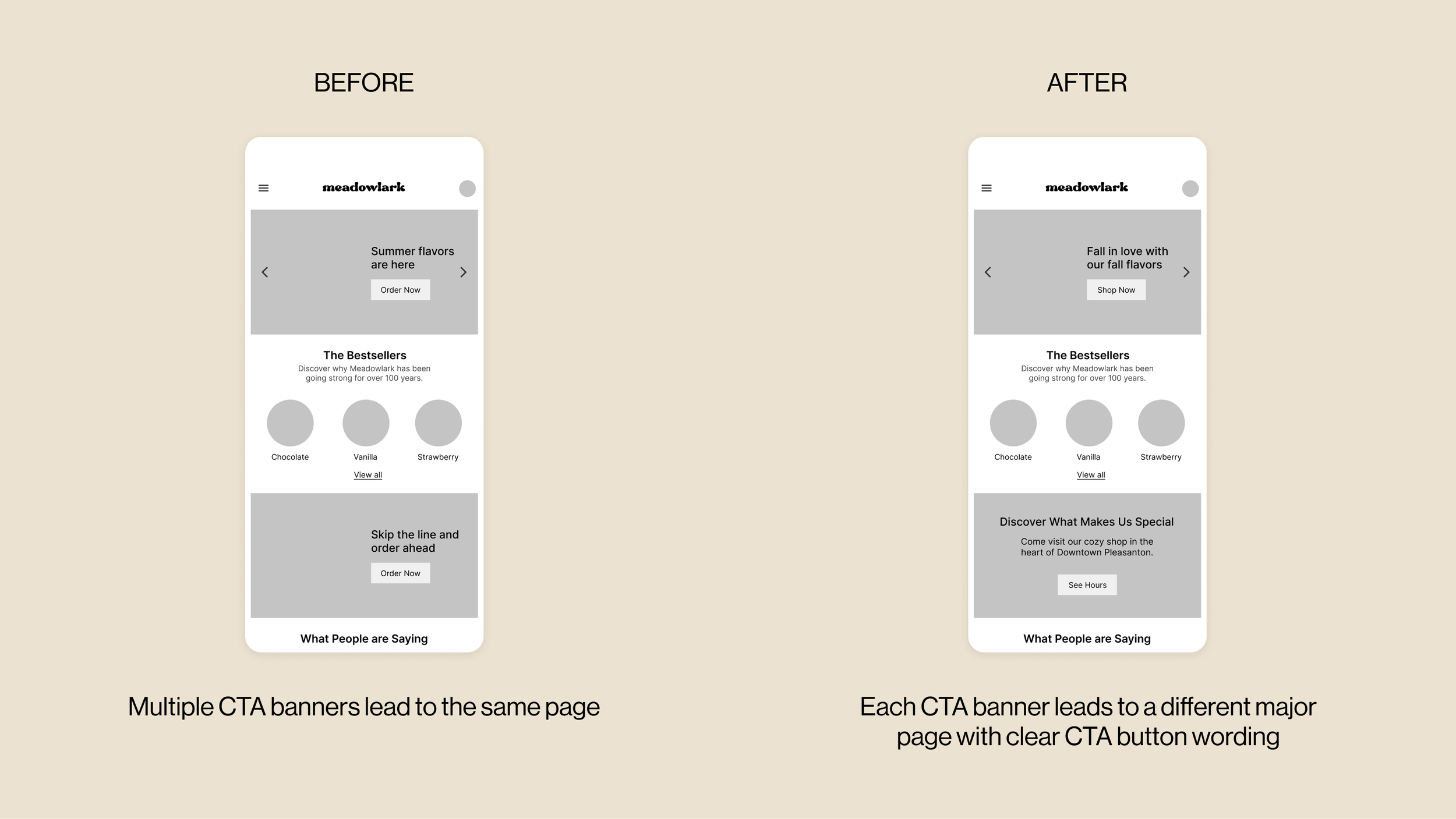
After one participant pointed out that ordering ice cream ahead was unrealistic, I realized it would be difficult for the business to time and prepare order ahead ice cream cone pickups. Thus, I pivoted the ordering system to an online shop where customers can purchase pints, dairy products, and other merchandise.
I also removed redundant CTAs and made each button clearly link to a different page.
A Realistic Pivot

Final Solution
All the information you need, at your fingertips.

Easily access key information through the homepage and sidebar navigation links.
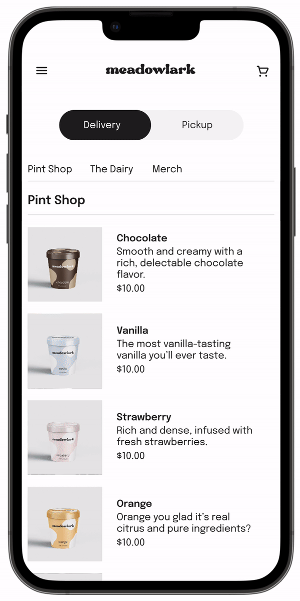
Purchase exclusive items online.
Browse through a curated selection of ice cream pints, organic dairy products, and custom merchandise.

Checkout with ease.
Place orders through a simple checkout process. Order confirmations are immediately sent to your email along with a pickup time.
I developed a set of brand guidelines to solidify the visual identity of my product. I also created all product images, illustrations, and banners used in the app to fully bring the brand to life.
Visual Identity


Reflection
Not every idea has to be good.
Throughout the process, I discarded ideas and pivoted from initial iterations. I realized getting as many ideas down, both good and bad, is the first step towards creating something good.
Thorough research pays off.
By conducting three rounds of interviews, I was able to pinpoint user needs and identify gaps and areas of confusion in my product.
The process isn’t perfect.
I came across new insights and learnings during the design process that required shifting priorities and adjusting the product to better align with customer needs.